Brew Haus
A distinguished coffee brand
 Austria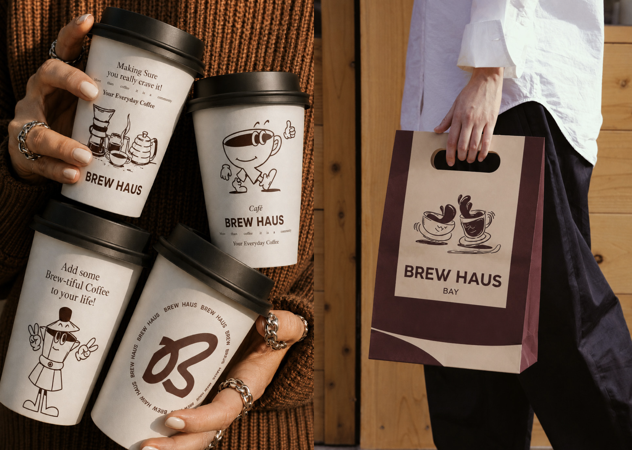
Project Overiew
Brew Haus came to Haraay Design Studio, Pune, knowing its coffee was better than its brand was communicating. In India's rapidly maturing coffee culture one of the most design-literate categories in F&B consumers who care about what is in the cup also evaluate the brand world it arrives in.
The Challenge
A clear perception gap between the quality of the coffee and the brand identity representing it Coffee is among the most design-literate categories in Indian F&B — consumers who invest in quality coffee evaluate brand quality as a proxy for product...
Our Approach
Haraay positioned Brew Haus as a coffee brand for people who treat their daily cup as a genuine ritual rather than a caffeine transaction. The work is built on the philosophy of elevated craft: great coffee is the product of patience, knowledge, and care, and every visual element should communicate exactly that.
Scope Of Work
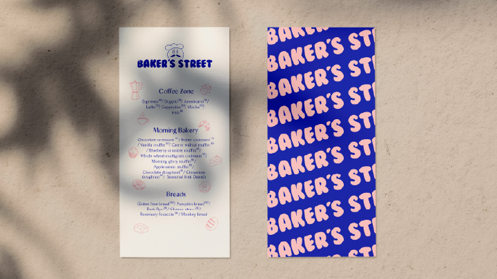
Cafe Brand Identity & Logo Design, Full Packaging Design Across Product Range, Retail & Gift, Packaging Design, Graphics System Menus, Collateral & Cafe Environment, Social Media Visual Language, Brand Guidelines
Outcome & Impact
The Brew Haus rebrand closed the perception gap between product quality and brand communication decisively. The new identity, packaging, and graphics system gave the brand a presence in premium retail environments it could not previously access, improved gifting appeal.
Frequently Asked Questions
When there is a visible gap between what the product delivers and what the brand communicates when you are winning on quality but losing at shelf, in gifting, or on social. Brew Haus was precisely this: an exceptional product undersold by an identity that did not match it.
Brand identity and logo, colour and typography system, full packaging design across the range, retail and gift packaging, graphics for menus, collateral, and cafe environment, social media visual language, and brand guidelines.